Here are the three maps created for this exercise:
Transport of Gloucester County
Physical Features of Gloucester County
Flood-prone areas of Gloucester County
I finally worked out the bugs. I originally was bleeped off at myself for not remembering to change the color of the roads until after I was done on Wednesday. I thought that if that's the worst thing I've done, then I'm fine.
Then, I came in Thursday and tried an experiment. Working without a net (no instructions), I loaded up an empty map and ArcCatalog, connected to the GC folder, switched the new, empty map to Layout Mode, added the Transport layer, clicked on the Roads Properties, and changed the color to something I thought would work better in contrast with the railroads, then saved the new version and exported the new version as a .jpg. I also did something similar with my Flood-prone map, when I realized two of the categories looked too similar. Doing this, I kept the original data the way it was, back in the GC folder. (Then, of course, on my way to work two hours later, it dawned on me that these latest versions of Transport and Flood-prone don't have my name on them -- I need to create a checklist for myself!)
Interesting process overall. When I was at the lab on Wednesday, I thought I had done OK by creating all of the layers by right-clicking each time, and I even got the maps to show up on my screen. Then, I closed out and opened back up, only to find those dreaded red exclamation points! I deleted all the layers and began again, using the drop-down File menu, etc., and making sure I stored the relative paths.
Here is an early version of the map with all of the layers, presumably in some kind of order (from the ground up), from before I changed the Transport and FloodProne maps.
I'd like to do more of this work, so that I can get things down cold. Any places where I can do that?
Wednesday, October 17, 2007


Thursday, October 04, 2007
Berlin-Clementon Nike base site
Check out my Yahoo Briefcase folder here to see 5 images of the same abandoned Nike missile site. Notice the varying land uses, including the 1930s aerial shot of the farmland.
Wednesday, October 03, 2007
Hello, old friends
Met up with a few old friends in class today -- Prime Meridian, the Cartesian coordinate system (with tag-along pals Sine and Cosine), and the Pythagorean theorem. Silly me, I once thought getting into journalism would keep me away from math; ha! and now the same is true for geography! Here we go.
Exercise04
Here is my latest version of Exercise 4, a map marking elevation and population density in Washington Township, Gloucester County, NJ. As you can see, I'm still trying to figure out how to get rid of the chatter amid the legends. We'll try to get that fixed.
As for my critique of the cartographic design: As I expressed at the bottom of my map, the color scheme for the Elevation portion is not your typical color scheme and, in fact, makes it difficult to comprehend. Additionally, in looking at these two parts, side by side, it's not easy to recognize that they are both representations of the same place. The Elevation section actually looks larger than the Population Density section (and, if I may say so, looks a bit like a human heart). I also don't like the size and location of the Elevation legend; first, it cuts into a portion of the map with the shaded box around it, plus it leaves a lot of dead air underneath a good bit of that map. I think the overall appearance of the Population Density segments is better. It's easy to tell that the higher densities are represented by the darker colors (brown & gold = Rowan?); I am a fan of this kind of color range, because it shows the relationships among sections. I chose the pink-to-red scale for mine, because I think it shows the same thing. Somewhere in my text, as well, I read that we older folks like a map like this -- as opposed to one with many different colors -- because they are easier on the eyes.
As for my critique of the cartographic design: As I expressed at the bottom of my map, the color scheme for the Elevation portion is not your typical color scheme and, in fact, makes it difficult to comprehend. Additionally, in looking at these two parts, side by side, it's not easy to recognize that they are both representations of the same place. The Elevation section actually looks larger than the Population Density section (and, if I may say so, looks a bit like a human heart). I also don't like the size and location of the Elevation legend; first, it cuts into a portion of the map with the shaded box around it, plus it leaves a lot of dead air underneath a good bit of that map. I think the overall appearance of the Population Density segments is better. It's easy to tell that the higher densities are represented by the darker colors (brown & gold = Rowan?); I am a fan of this kind of color range, because it shows the relationships among sections. I chose the pink-to-red scale for mine, because I think it shows the same thing. Somewhere in my text, as well, I read that we older folks like a map like this -- as opposed to one with many different colors -- because they are easier on the eyes.
Monday, September 24, 2007
Phila. area home prices: Interactive maps
Here is a neat link that tells Inquirer readers what the home values are in their communities.
Here is New Jersey, here is Pennsylvania, and here is Philadelphia.
Here is New Jersey, here is Pennsylvania, and here is Philadelphia.
Exercise 3
Tentative answers:
3.1: There are 12 layers in scene 1.
3.A: There are no layers of point data.
3.B: There are two layers of line data: CN stream and Gloucester County roads.
3.C: There are eight layers of polygons: watershed boundary, cn flood, cn wetlands, Rowan buildings, Rowan parking, Rowan paving, land use and each of the municipal boundaries.
3.D: There are two layers of raster data: elevation and orthophoto.
What happens when I click on GloCo. roads? The roads appear.
3.2: When you click on the far left of a row, that row turns light blue and the town's border lights up.
3.3: The largest municipality in GloCo. is Franklin Township, at 56.47 square miles. The smallest is Newfield Borough, at .78 square mile.
3.4: The greatest population in Glo.Co. in Pop2000 is Washington Township, at 47,114. The smallest is, again, Newfield, with 1,616.
3.5: The cn_watershed extends into Mantua Township, Harrison Township, Pitman and Glassboro.
3.6: The land use of Bunce Hall is marked as commercial/services. That might be accurate, as far as the town's land-use plan is concerned, but it seems inaccurate in the"real world." Perhaps it should be public, or institutional.
3.7: The highest point near Rowan University is The Ridge, which lies west-southwest of the campus.
Finally, in addint the kcsl2001.shp layer to this map, I discover that there are 12 known contaminated sites within the Chestnut Branch Watershed.
3.1: There are 12 layers in scene 1.
3.A: There are no layers of point data.
3.B: There are two layers of line data: CN stream and Gloucester County roads.
3.C: There are eight layers of polygons: watershed boundary, cn flood, cn wetlands, Rowan buildings, Rowan parking, Rowan paving, land use and each of the municipal boundaries.
3.D: There are two layers of raster data: elevation and orthophoto.
What happens when I click on GloCo. roads? The roads appear.
3.2: When you click on the far left of a row, that row turns light blue and the town's border lights up.
3.3: The largest municipality in GloCo. is Franklin Township, at 56.47 square miles. The smallest is Newfield Borough, at .78 square mile.
3.4: The greatest population in Glo.Co. in Pop2000 is Washington Township, at 47,114. The smallest is, again, Newfield, with 1,616.
3.5: The cn_watershed extends into Mantua Township, Harrison Township, Pitman and Glassboro.
3.6: The land use of Bunce Hall is marked as commercial/services. That might be accurate, as far as the town's land-use plan is concerned, but it seems inaccurate in the"real world." Perhaps it should be public, or institutional.
3.7: The highest point near Rowan University is The Ridge, which lies west-southwest of the campus.
Finally, in addint the kcsl2001.shp layer to this map, I discover that there are 12 known contaminated sites within the Chestnut Branch Watershed.
Wednesday, September 19, 2007
Questions involving my Nike base project
These are some of the early questions I must research as I work on this project?
1. What were these sites before they were Nike bases?
2. How were they obtained? What happened to the existing users (and uses)?
3. What was the criteria for picking these sites: location? Access to highways? Populations? Topography?
4. Why were they closed?
5. What happened to the sites once they were closed?
6. What kinds of remediation was necessary at these sites?
7. What are they now?
1. What were these sites before they were Nike bases?
2. How were they obtained? What happened to the existing users (and uses)?
3. What was the criteria for picking these sites: location? Access to highways? Populations? Topography?
4. Why were they closed?
5. What happened to the sites once they were closed?
6. What kinds of remediation was necessary at these sites?
7. What are they now?
Idea for Class Project: Nike missile bases
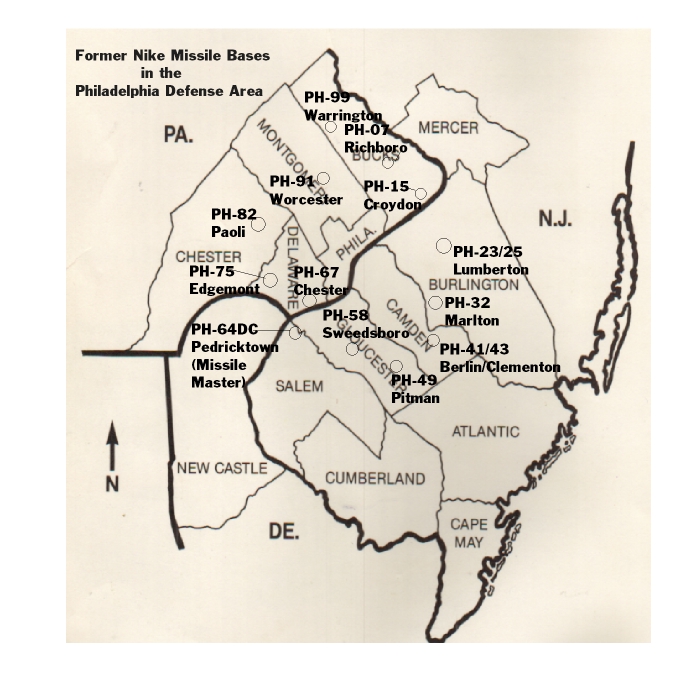
At the height of the Cold War, a dozen anti-aircraft missile sites were located in the Philadelphia metropolitan area, including six in South Jersey, the PH command center for the entire grouping among them. The sites contained either conventional weaponry, nuclear weapons or both. This is a rough map I found online that marks the sites. I would like to create something similar, focusing on South Jersey, marking the command centers and launch sites, which, because of technology at the time, had to be located anywhere from a half-mile to a few miles away.
About 250 such sites were established across the United States. These sites began to be decommissioned by the early 1970s, as the United States found better ways (aka, more powerful missile systems) to protect its shores, and many of the sites have subsequently been demolished and turned over to private interests, which have largely turned them into suburbia.
The site in Marlton, N.J., is now the location of a housing development, located across from a high school. I'm still researching, but I believe the nuclear-warhead Berlin/Clementon site (actually Gloucester Township), which sits amid several fairly new strip malls, remains largely undeveloped. The Swedesboro (actually Woolwich Township) site just got the go-ahead to be developed. I thought I read it would be a small "smart growth" site, but I am not sure.
Always eager to hear suggestions as I begin this project.
About 250 such sites were established across the United States. These sites began to be decommissioned by the early 1970s, as the United States found better ways (aka, more powerful missile systems) to protect its shores, and many of the sites have subsequently been demolished and turned over to private interests, which have largely turned them into suburbia.
The site in Marlton, N.J., is now the location of a housing development, located across from a high school. I'm still researching, but I believe the nuclear-warhead Berlin/Clementon site (actually Gloucester Township), which sits amid several fairly new strip malls, remains largely undeveloped. The Swedesboro (actually Woolwich Township) site just got the go-ahead to be developed. I thought I read it would be a small "smart growth" site, but I am not sure.
Always eager to hear suggestions as I begin this project.
Tuesday, September 18, 2007
Drivers are stuck in traffic; this is news?
Someone's hard-earned dollars went toward telling us what we already know -- that traffic is bad and it's getting worse!
KC-K or KC-Mo
The NPR program "Day to Day" had an interesting segment on the geographical and sociological differences between Kansas City, Kan., and Kansas City, Mo.
Monday, September 17, 2007
Exercise 2 Answers
2.1. How easy did you find I-MAP NJDEP?
I found it quite easily, and quickly made a link to it on this blog, so that I can search again.
2.2. What kinds of data are available?
There are dozens of categories, everything from congressional, legislative, county and municipal boundaries to contamination sites to open space to water bodies to streams to various demarcations of wildlife data.
2.3. What kinds of data are not available that you would like to see?
Given the rise of bear and coyote sightings in NJ, it might be useful to map their territories. And, of course, given my affection for the issue of cemeteries and land use, I would like to see cemeteries marked, including the various types (public, historic, religious, etc.)
2.4. What level of user do you think would use this service (novice, educated adult, expert, etc)? Explain.
I think an educated adult or expert would be able to use this easily. Someone without any knowledge of mapping or geography might be limited.
2.5. What were the 3 most significant limitations that you encountered using I-MAP?
1- Not easy to step back in time, a-la move back several steps (more than one step), or at least I could not figure out how to do it. When I got stuck, I just started over.
2 - Like to see more variation, besides 1930 and 2002 views.
3 - Information is dated. To the best of my memory, I tore down our pool prior to 2002, but that image is still there.
4 - Perhaps I just couldn't spot it, but this does not seem to indicate zoning delineations
2.6. What are the benefits that you see for internet mapping technologies such as I-MAP?
I can work on a map without loading in mammoth software programs. And I can work on any computer, whether it is on the Rowan campus, hooked into the Rowan network or not.
2.7. How has the land in your neighborhood change since 1930?
It remains mostly rural, but there are a handful of more homes in my area, plus what appears to be relatively new-growth woods. About a half-mile from my home now is a very large lake, created from an old sand-mining site (and recently taken over by the NJ Fish and Wildlife folks). It is hard to tell whether it is there in 1930 or whether the 1930 image is just of the sand pit.
And, of course, there were no protected Pinelands in 1930. My property in on the fringe of the Pinelands.
I found it quite easily, and quickly made a link to it on this blog, so that I can search again.
2.2. What kinds of data are available?
There are dozens of categories, everything from congressional, legislative, county and municipal boundaries to contamination sites to open space to water bodies to streams to various demarcations of wildlife data.
2.3. What kinds of data are not available that you would like to see?
Given the rise of bear and coyote sightings in NJ, it might be useful to map their territories. And, of course, given my affection for the issue of cemeteries and land use, I would like to see cemeteries marked, including the various types (public, historic, religious, etc.)
2.4. What level of user do you think would use this service (novice, educated adult, expert, etc)? Explain.
I think an educated adult or expert would be able to use this easily. Someone without any knowledge of mapping or geography might be limited.
2.5. What were the 3 most significant limitations that you encountered using I-MAP?
1- Not easy to step back in time, a-la move back several steps (more than one step), or at least I could not figure out how to do it. When I got stuck, I just started over.
2 - Like to see more variation, besides 1930 and 2002 views.
3 - Information is dated. To the best of my memory, I tore down our pool prior to 2002, but that image is still there.
4 - Perhaps I just couldn't spot it, but this does not seem to indicate zoning delineations
2.6. What are the benefits that you see for internet mapping technologies such as I-MAP?
I can work on a map without loading in mammoth software programs. And I can work on any computer, whether it is on the Rowan campus, hooked into the Rowan network or not.
2.7. How has the land in your neighborhood change since 1930?
It remains mostly rural, but there are a handful of more homes in my area, plus what appears to be relatively new-growth woods. About a half-mile from my home now is a very large lake, created from an old sand-mining site (and recently taken over by the NJ Fish and Wildlife folks). It is hard to tell whether it is there in 1930 or whether the 1930 image is just of the sand pit.
And, of course, there were no protected Pinelands in 1930. My property in on the fringe of the Pinelands.
Alternate Public Folder: IMGIS_Fall_07
Here is the link to an alternate public folder, in the event you or I cannot get all of the materials to the Rowan H drive.
My house 2002

This is the semi-correct picture of my home from 2002, although I believe it was longer than that since I had my backyard pool torn down (it was cheaper to have it knocked down and hauled away than to fix all the nicks and dinks to make it functional).
The purple line marks from the home to wetlands, a distance of a shade over 1,000 feet.
And here is a link to this item in my public folder. Here is a wider view from my public folder.
My house 1930

This is the picture of where my house was (not) located in 1930.
This is the link to this item in my public folder, and this is a wider view, complete with 2002 wetlands and 2002 body of water Penbryn Lake, or Penbryn Pond, created from a sand-mining pit.
My activity space
Here is the map I'm doing of my activities and travels for the week. You can also find it among the links to the left, titled "My activities map."
Wednesday, September 12, 2007
Architecture 2030 report on rising seas
Here is an important report on the effect of rising sea levels, complete with interactive visuals.
Another journalism tool ... and I'm sure I will find many more
Here is an interesting post from a blogger interested in seeing journalism survive in the 21st century. It's time to get authorities to provide lat & long with their information, so that mapping journalists can do their jobs.
Here's why I'm here
This and this are why I am in this class, and in this program.
Here is something I could do for the Philadelphia Daily News; this is at the Arizona Daily Star.
Here is something I could do for the Philadelphia Daily News; this is at the Arizona Daily Star.
Monday, September 10, 2007
Exercise01
It was surprisingly easy to create a blog. This is one of a few that I've created, but it has been dormant forever.
This should be easy to turn in assignments. I don't anticpate any problems.
I also have a blog I created after taking Land Use, titled: whistlingpastgraveyard.blogspot.com, another (sadly) dormant blog about cemetery use in the United States.
Biosketch
Google Earth is a fun tool. I learned about last January, when I took Dr. Hasse's Land Use class. But we must remember that it is only a tool. For instance, the link to my house below had to be, um, tampered with, to point out my exact home location. Google got me in the neighborhood, but not to the home itself. Then there is the swimming pool in my back yard that hasn't been there for about 5-6 years. So, someone who thinks I have a pool is grossly mistaken. Then there is the case of someone I know who needed directions in Cherry Hill and found an aerial shot of Garden State Park racetrack (RIP). So, have fun with this, but don't let it be a substitute for legwork.
EXERCISE_01
-30- (this is a newspaper symbol signifying the end of a story)
This should be easy to turn in assignments. I don't anticpate any problems.
I also have a blog I created after taking Land Use, titled: whistlingpastgraveyard.blogspot.com, another (sadly) dormant blog about cemetery use in the United States.
Biosketch
Google Earth is a fun tool. I learned about last January, when I took Dr. Hasse's Land Use class. But we must remember that it is only a tool. For instance, the link to my house below had to be, um, tampered with, to point out my exact home location. Google got me in the neighborhood, but not to the home itself. Then there is the swimming pool in my back yard that hasn't been there for about 5-6 years. So, someone who thinks I have a pool is grossly mistaken. Then there is the case of someone I know who needed directions in Cherry Hill and found an aerial shot of Garden State Park racetrack (RIP). So, have fun with this, but don't let it be a substitute for legwork.
EXERCISE_01
-30- (this is a newspaper symbol signifying the end of a story)
Subscribe to:
Posts (Atom)